The Challenge
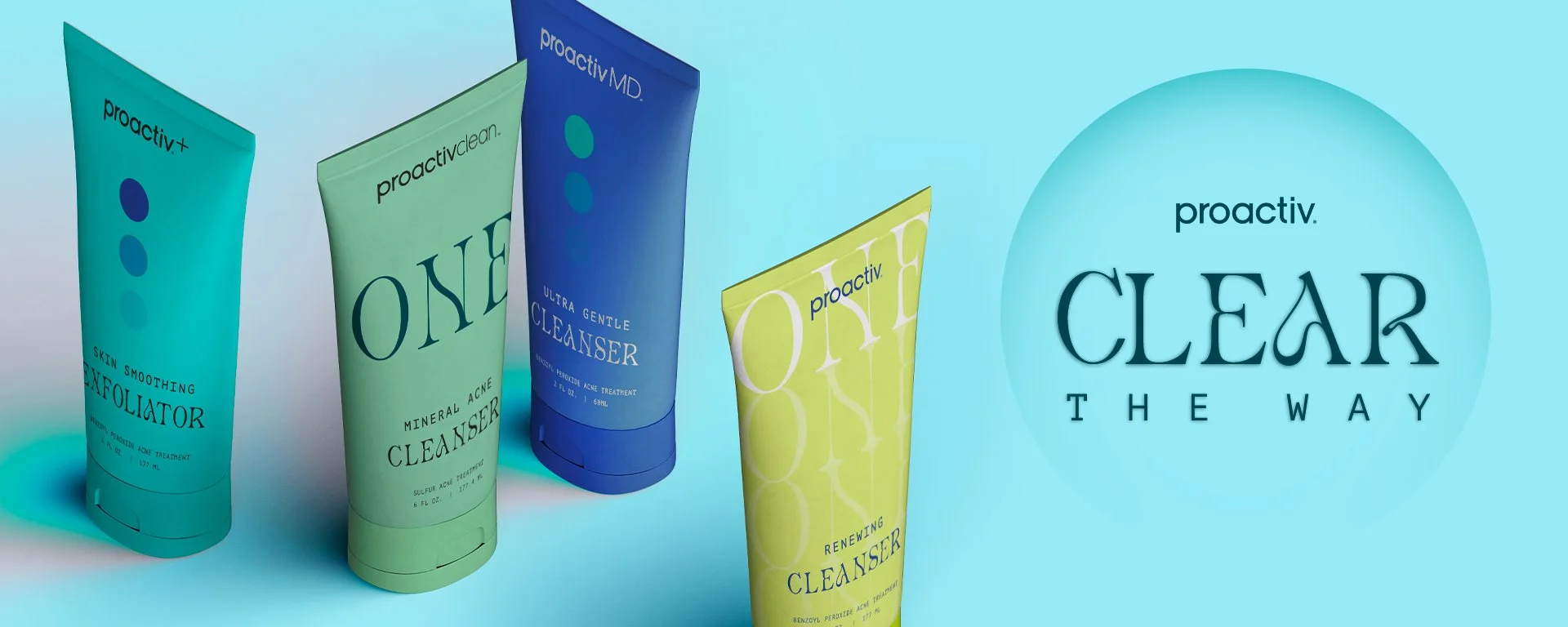
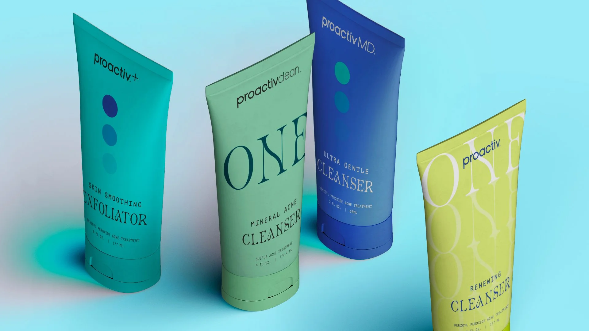
Born in the 90s, Proactiv challenged to reinvent its look & feel to attract the new Gen Z consumers, while also reengaging their original millennial clientele. The goal: How far can the boundaries be pushed in the overall design, color & aesthetic?
The Outcome
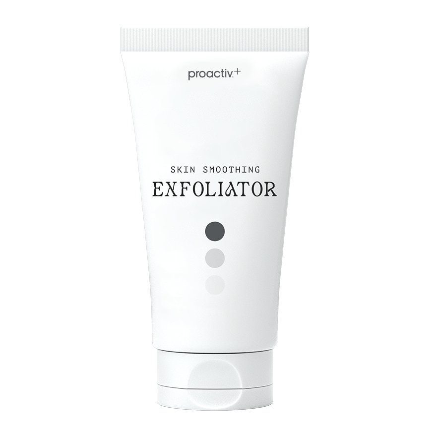
Modern & fluid typography, a subtle graphical approach & a fresh rich color palette that nods to Proactiv’s classic teal.